
Bridging the Design-Development Gap
<!--
Work info
-->
Client:
Smartify
Role:
UX Designer
Year:
2025
The Challenge
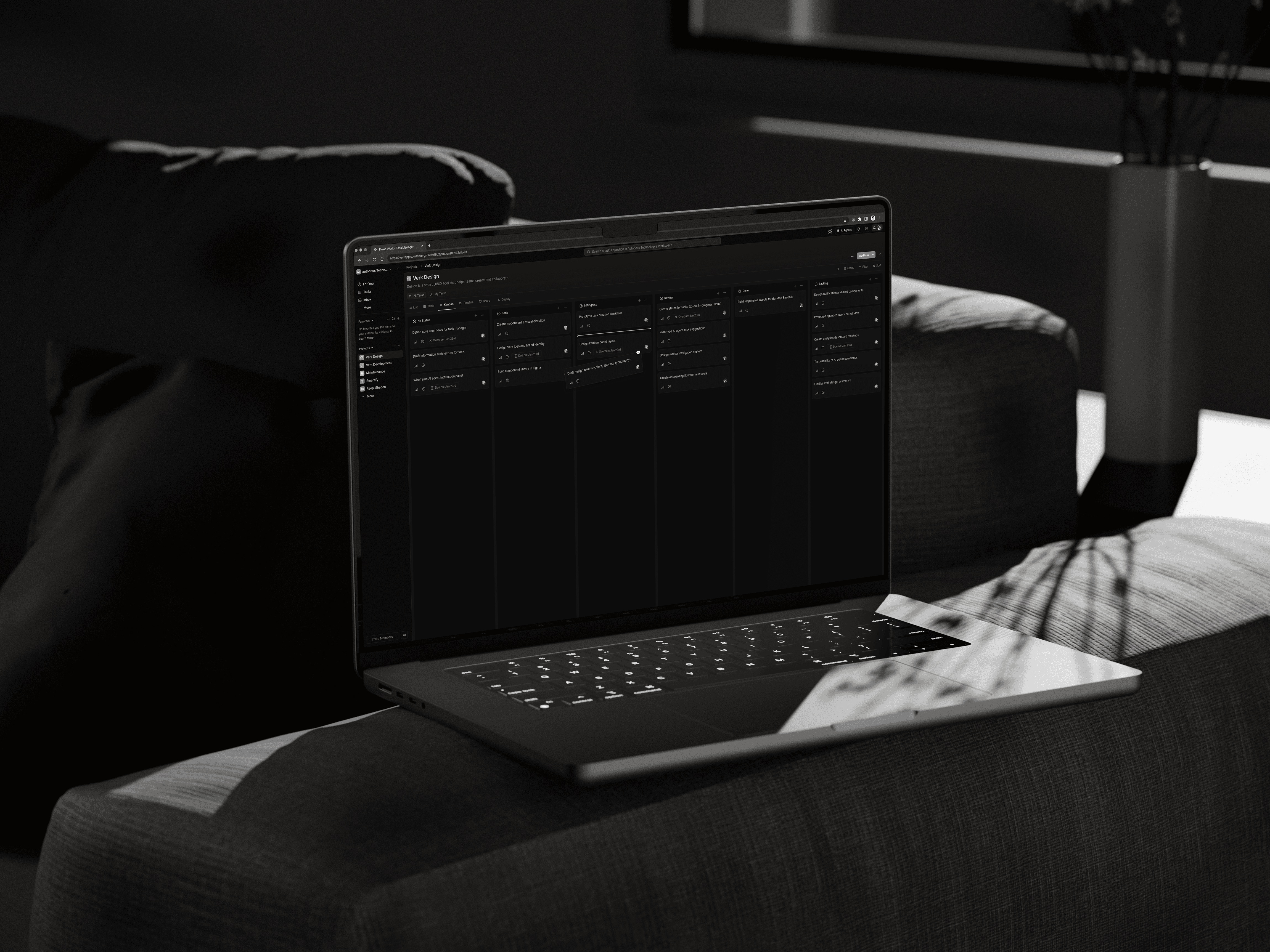
When I joined Verk to create an AI-powered task manager that lets users build autonomous agents for complex workflows, I faced a familiar issue: my designs weren’t matching the code.
Even though I had a design system, thorough documentation, and pixel-perfect Figma files, the difference between what I designed and what was built kept growing.
Buttons were in the wrong spots. Spacing was all over the place. The AI task pipelines looked completely different on screen than they did in my mockups.
The stakes were high.
Verk’s value relies on making complex AI workflows feel simple and easy to handle. If our interface couldn’t handle that complexity—or even worse, if our team couldn’t build it consistently—we’d fail our users before they ever got started.
The Real Cost
Every design change required:
- Multiple meetings to clarify things
- Slack threads with screenshots marked in red
- Developers guessing spacing values
- Me explaining the same design choices again and again
Both teams were frustrated.
Developers felt they were always missing the mark. I felt like I was talking to a wall. The speed of our sprints dropped. New features got delayed.
I realized this wasn’t just about the quality of the handoff—it was about a deep misunderstanding between how designers think and how developers build.
Understanding the Root Causes
I spent two weeks watching how the developers worked with my files and talked to the team (three front-end developers and one design lead).
The patterns became clear:
1. Typography & Spacing Chaos
Task lists looked messy because developers were using inconsistent spacing tokens.
A card might have padding of 12px in one place and 16px in another—both close to my design, but enough to create visual noise.
2. Dashboards with 20+ AI task cards became hard to read quickly.
The 14px base font I chose looked fine in Figma but felt cramped when users needed to check multiple agent statuses at once.
3. Component Interpretation Gaps
Buttons, switches, and modals were built differently than designed because developers didn’t know which ShadCN component matched my Figma designs.
Was my "Primary Button" the default ShadCN one or did it need customizing? Nobody was sure.
4. Tool Misalignment
The team was building in Next.js with Tailwind CSS and ShadCN components—but my design system wasn’t built with those tools in mind.
I was designing with abstract pixel values while developers needed Tailwind utility classes. I’d say 16px padding and they’d need to know if that was p-4 or p-5.
My Approach: Building Bridges, Not Just Screens
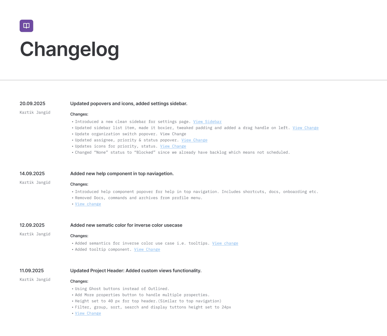
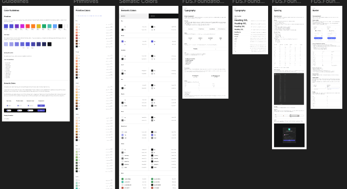
1. Redesigning the Design System for Developers
Our existing design system had tokens, but they weren’t practical.
So I rebuilt it with developers in mind:
a. Typography Reset
I changed the base font size from 14px to 13px after testing with real AI task data.
This let us show 20% more task metadata per card without making it hard to read. I tested this by looking at dashboards with 15+ active agent cards—our most common situation.
b. Tailwind-First Spacing
I introduced a unified shorthand: S1 = P1 = GAP1 = M1 = 4px.
This meant:
- Designers used S1, S2, S3 in Figma (4px, 8px, 12px)
- Developers used p-1, p-2, p-3 in Tailwind (4px, 8px, 12px)
Same values, different syntax, no confusion.
Before: “Is this spacing 12px or 16px?”
After: “Use S3” → Developer types gap-3 → Done.
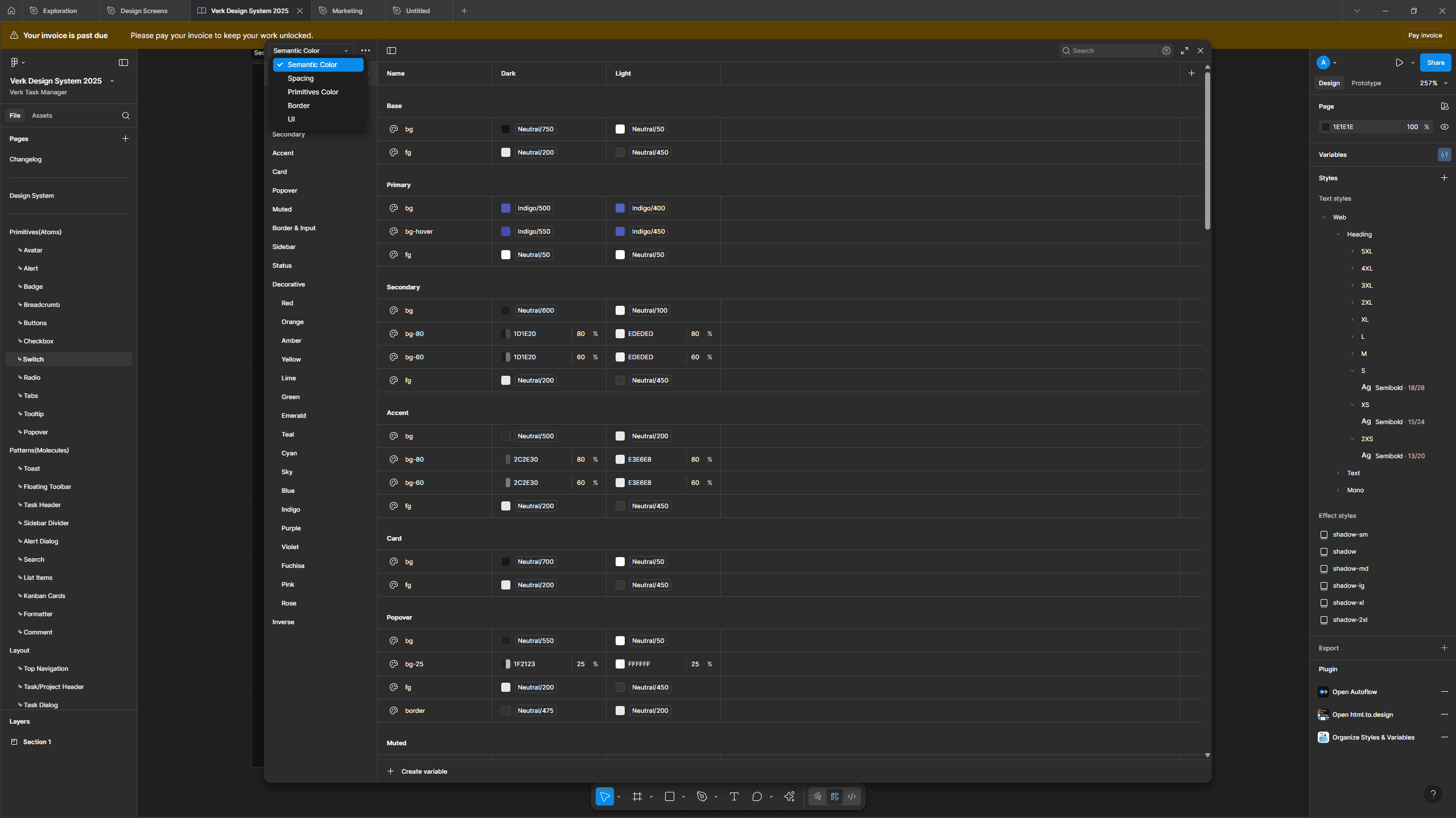
c. Color System Aligned to CSS
I picked colors that matched Tailwind’s palette and met WCAG AA standards.
Every color in Figma had a matching Tailwind class next to it.
d. “Alien” Naming Conventions
I created unusual but memorable component names to reduce confusion:
- TaskCard-Compact vs TaskCard-Expanded (not “small” or “large”)
- AgentStatus-Idle vs AgentStatus-Processing (clear states)
- Modal-Destructive vs Modal-Confirmation (intent-based)
These names felt odd at first but became a shared language that eliminated the “which button do you mean?”
problem.
2. Starting With Atoms, Not Organisms
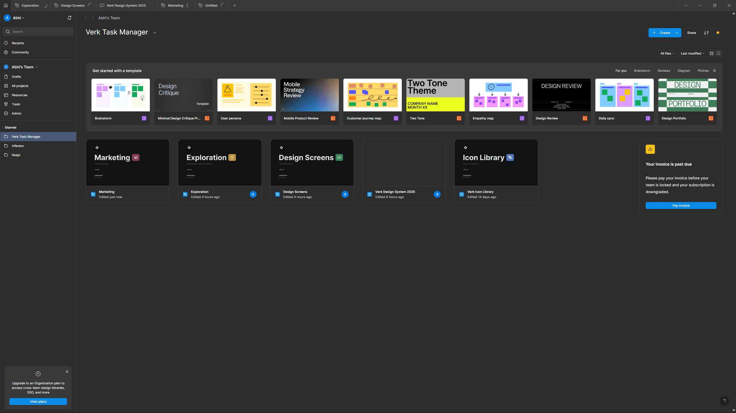
Instead of redesigning whole dashboard pages, I went back to basics and rebuilt our foundation from scratch using the new design system.
I started with the smallest elements:
- Input fields with proper focus states
- Buttons with loading and disabled states
- Avatars with fallback patterns
- Search bars with empty states
- Switches and toggles mapped directly to ShadCN variants
Each component had a checklist for developers:
- Which ShadCN component is this?
- What Tailwind classes achieve this spacing?
- How does this scale on different screen sizes?
- What props or variants are available?
Example: For our primary button, I documented:
- Component: ShadCN Button (variant="default")
- Base classes: px-4 py-2 text-sm (Tailwind)
- States: Default, Hover, Active, Disabled, Loading
- Use case: Primary actions in modals, forms, AI task creation
Only after these small parts were solid did I move on to bigger designs like sidebars, modals, and the AI task pipeline interface.
3. Enabling Developers Through Knowledge Transfer
Design systems don’t work if people don’t know how to use them.
I spent time teaching:
Figma Dev Mode Training
I ran a 30-minute session showing developers how to:
- Inspect spacing and typography values
- Copy CSS directly from components
- Export assets at the right resolution
- Understand component variants and properties
Curated Learning Resources
I shared articles and guides on:
- Building accessible forms
- Implementing proper loading states
- Responsive design patterns in Tailwind
- Component composition patterns
Continuous Micro-Documentation
For every new component or pattern, I added a short explanation of why it was designed that way:
- “Why does the AI task card have fixed height?
→ So dashboards keep a visual rhythm when tasks have different content lengths”
- “Why is the modal max-width 480px?
→ Optimal reading length for task descriptions and form inputs”
The Outcome
After three months of thorough redesign and teamwork, the results were clear and measurable:
Efficiency Gains
- 65% drop in design and development friction — This was tracked by looking at Slack messages, meetings, and changes needed because of unclear design instructions
- Developers built new screens twice as fast — Using the component library and token system, they could create features in half the usual time
- 50% more reuse of components — Standard components were used across different features instead of being made from scratch each time
Product Quality
- 40% better readability of task lists — Checked through internal usability tests where 8 team members reviewed dashboards with over 20 AI tasks
- No spacing issues in the last two sprints — Achieved by using a single spacing system
- Faster feature delivery — The AI agent creation flow was released two weeks earlier than planned
Team Satisfaction
Developers felt more confident when implementing designs.
I no longer spent hours in clarification meetings and could focus more on solving new design challenges.
Key Learnings
- Design is about translation, not just creation
My role isn’t just making things look good — it's ensuring they can be built correctly.
Understanding the tools developers use, like Tailwind, ShadCN, and Next.js, changed how I approach design.
- Start atomic, scale systematically
Building basic components first created a strong foundation.
Every complex screen became a combination of reliable parts.
- Shared language removes friction
Tokens, naming rules, and documentation created a common way of talking.
Saying "use S3 spacing" is quicker and clearer than saying "make it look balanced."
- Systems grow over time
The effort put into documentation and training gave big returns.
Each new feature now builds on a strong base instead of causing new problems.
- Self-awareness helps grow faster
Recognizing when I was overthinking or being unrealistic helped me become a better team member.
Good design should help the product and the team, not just my personal work.
- Technical empathy is important
Learning about responsive design, state management, and component structure made me a better designer.
I could predict development challenges and design around them.
Conclusion
Designing Verk's AI task manager showed me that closing the design and development gap isn’t about perfecting handoffs — it’s about building systems that both sides can understand.
By starting small, matching developer tools, investing in learning, and staying self-aware, I changed a frustrating collaboration problem into a scalable and efficient process.
The result is a product that handles AI complexity smoothly, delivers features faster, and keeps everything consistent across every screen — while keeping both designers and developers on the same page.